


Last time on the Kickstart This! Guide to Getting Your Game Funded, we talked about how to whip up a community around your project and keep them engaged through social media and other channels. Now we’re going to look at what they see, hear, and feel when they land on your crowdfunding page.
When I write Warp Zoned’s Kickstart This! spot, I usually focus on the Kickstarter crowdfunding platform rather than Indiegogo or the handful of other options available. I find it more intuitive, although recently Indiegogo has changed its page design to mirror its rival. As they say, imitation is the sincerest form of flattery. All the aspects I’m going to touch on can apply across all platforms, so try both and see which one suits you best.
When I talk about design, don’t confuse this with the design of the game. This is all about how you design and lay out your Kickstarter page, although the aesthetics of your game should influence your Kickstarter page to make it connected for a smoother audience journey.
Design
Before we even get to how your crowdfunding page appears, we have to tackle one of the key tools you can utilise to strengthen your project before it launches… its title.
The Title
Have you thought long and hard about the title of your game or product? No matter if it is a game, book, or film, the title affords you the first chance to sell people on what it is, or at least hint at the story, genre, or theme. They may hear the title before they even see your poster or video, and it has to hook them.
A great title will immediately inform potential backers of the storyline, genre, main character, or all three. Here are a few examples of titles that manage to convey some of these elements:
Best Examples
Some of these titles might seem basic or even perfunctory, but I can guess which genre they all are. Some tell me the main character, group, or theme.
The other option is to go for something mysterious, funny, or weird that it begs potential backers to probe deeper, to search it out or open the Kickstarter campaign page. Here are a few of my favourites:
Best Examples
While you can maybe hazard a guess at what these games could be about, the titles lure you in by an intriguing play on words.
Poster
If you are lucky enough to have a game artist, ask them to craft a poster for you. This is, by and large, the best option to sell your game, and if you scroll through Kickstarter’s game section, you will find the majority of games have employed an artist to render a poster.
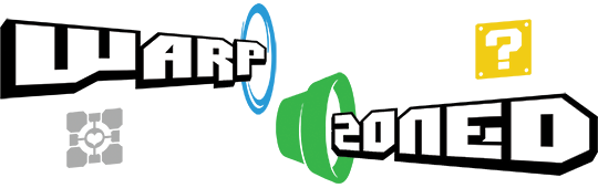
If you do not have an artist on hand, have a go at creating one yourself, ideally from game components and screenshots from your game. There is nothing wrong with using a screenshot as the poster, as long as it shows the best aspects of the game, or grabs the attentions of those browsing Kickstarter. The simple poster for Superhot is of a pixelated head being blown apart, but its art style, the same used the game, is captivating. Here are a few other examples that use screenshots coupled with a title for their poster:
Best Examples
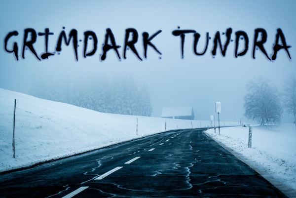
It may be you do not have any screens yet, and if you don’t, it might be worth considering holding off on a crowdfunding campaign until you do. However, if you absolutely need to launch, then I would recommend searching for some stock images and create an abstract poster based around the theme or genre of your game. There are many sites that offer royalty free images, but I often use Pexels to create a mock poster.
For example, if you were making a game like Dark Souls your poster could be a smouldering fire. Here is something I cooked up in two minutes in Word:
Which happily leads us to font choice for the poster and the campaign.
Fonts
I love fonts, and spend an insane amount of time downloading free ones from DaFont. This will tie into the design of your game as well, but choosing a font on your main poster, the one people see when they are browsing Kickstarter projects, is key. I cannot stress how important it is that the title of your project is readable. People are not just browsing Kickstarter on their computers or laptops, but also on their phones. Make sure your title stands out on a small display.
Pick a font that matches your genre. If your game is set in a dystopian future, go for something edgy or distorted, or instead play against expectations and opt for something fun and poppy like We Happy Few. If it’s a medieval or fantasy game, play around with Celtic fonts or Norse Ruins. Pick a few of your favourites and then ask people which one they think works best.
If you have a poster image without a title in it, what are you hoping to communicate? There are a few exceptions that have managed to gain funding with just a picture alone, but it is really rare. What is more common is for the game’s title to be presented on a coloured or gradient backdrop, or a simple image, in which case the title and font are the only two things that are going to compel a potential backer to click on your project and find out more. Here are a few examples of this:
Best Examples
One thing you will probably note is that all if these games are in the horror genre, which is easier to signify with a lack of graphical elements. In fact, the absence of anything other than the title makes you wonder why they have not shown anything. Just as with the best horror movies, you never really see the monster in full.
Next, we’ll be looking at the all-important video that will accompany your campaign, as well as how to make headers more attractive.
And in case you missed any of the other parts of our “Kickstart This! Guide to Getting Your Game Funded,” here they are…